
PenFed Credit Union
User Interface Lead
2016 – 2017
Design System
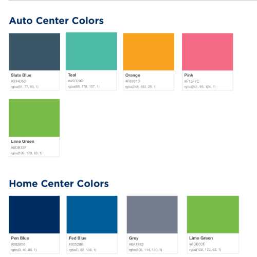
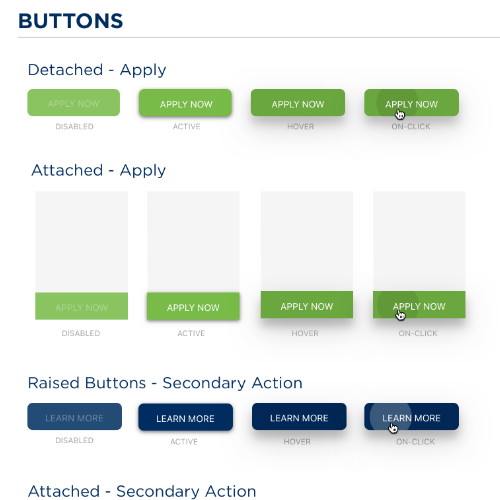
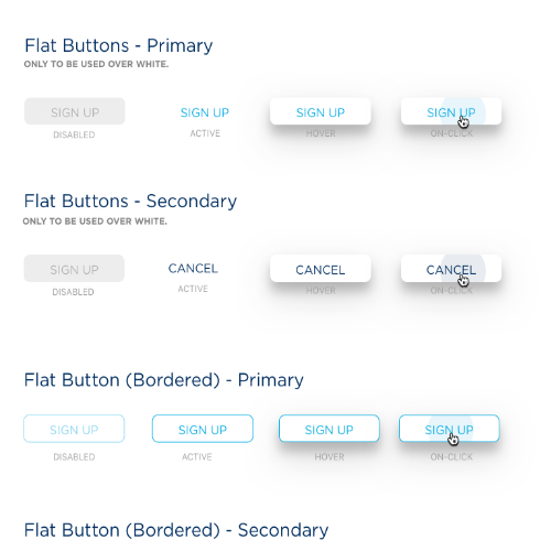
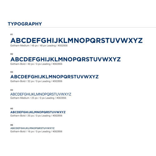
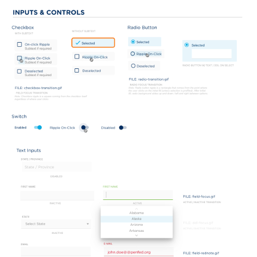
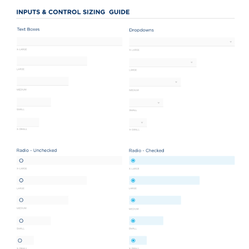
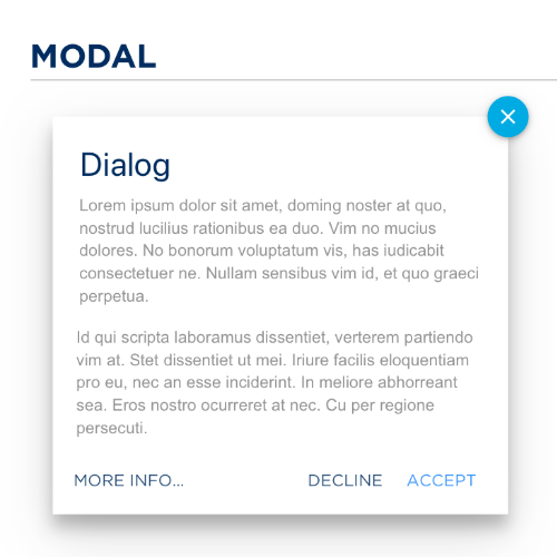
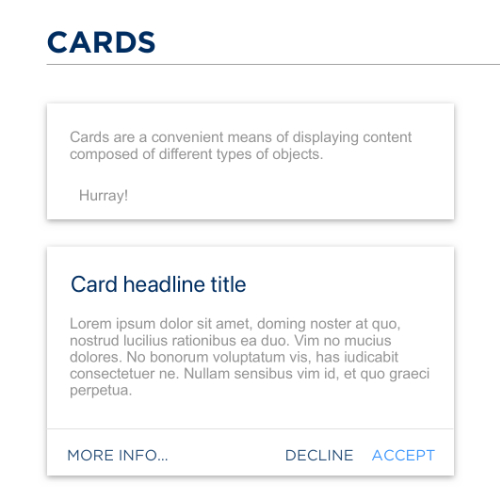
When I started at PenFed, their website had different layers from UI that were clearly from a few rebranding efforts over the years. Some areas had a more updated style, while others were still in an older style. One of my primary goals was to slowly update all pages of the site and applications for various products to a new design system. I have outlined a few pieces of that design system below.
Colors Buttons & Fonts
Inputs & Controls
Modals & Cards
Microinteractions
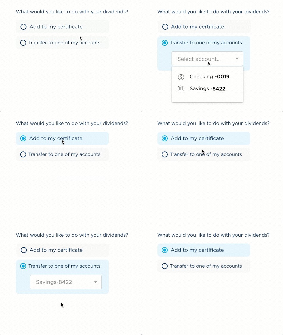
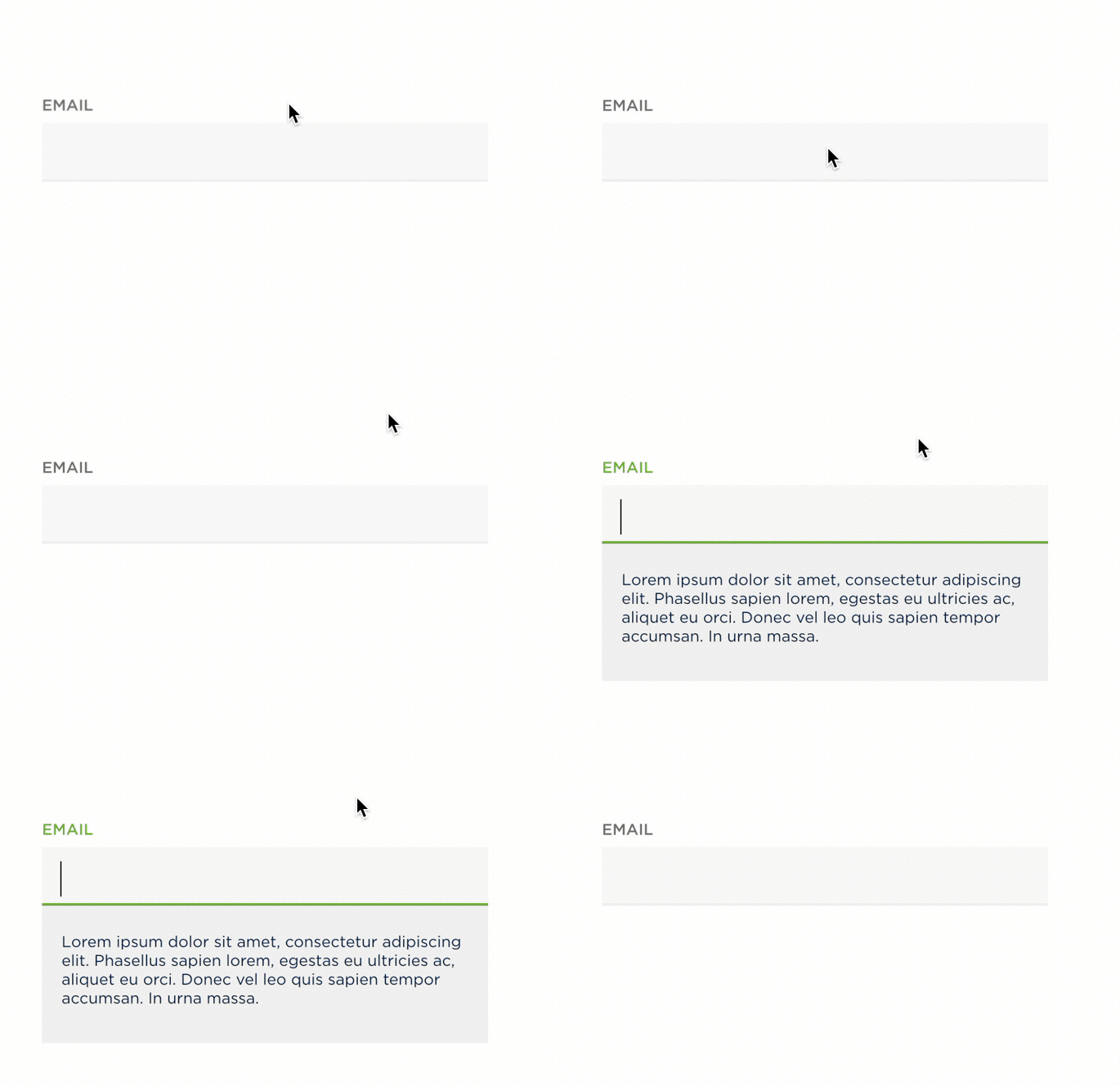
After initial field styling, I created animations like these to better inform our developers on the intended behavior of the component. (These ones don't expand like the others, so look but don't touch.)
Progress Bar Iterations
The main challenge we faced when redefining PenFed's credit card application process was making it clear where the client was in a process with many steps. You can see below how there are many different ways to display the user's position in the flow. Ultimately, we decided to go with the final iteration (on the bottom right) that you will see in the credit card flows section. We chose this option to limit visual complexity while still informing the user where they stand in the very long flow.
Careers Page
Mid 2016, human resources came to my team with the challenge of reworking the existing careers page. The first step was to develop the design rails for the project, which you can view below.
Low Fidelity Wireframes
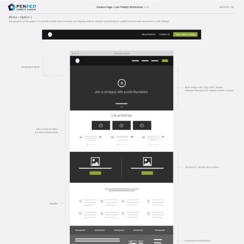
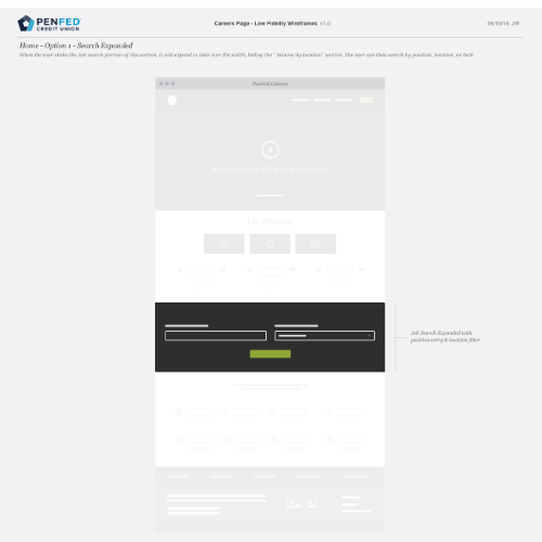
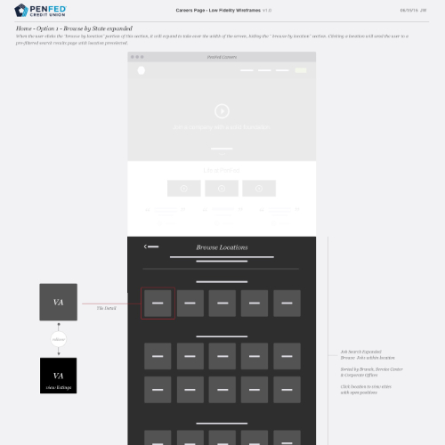
Once we had a game plan laid out in the design rails, we created a survey for the research team to send out. After analyzing the results from the survey, we developed some low-fidelity wireframes using a hybrid block framing with a little more detail and annotations.
Hi-fidelity Wireframes
After the business and developers saw the low fidelity wireframes, they decided to remove the on-site job listing functionality. They removed them because we needed a quicker solution than the wireframes proposed. This alternative was great because we just needed to include a link to the job board, saving ourselves much complexity. Once we all agreed on the scope and final feature set, I developed the hi-fidelity wireframes to further build out the features on the page.
Designs
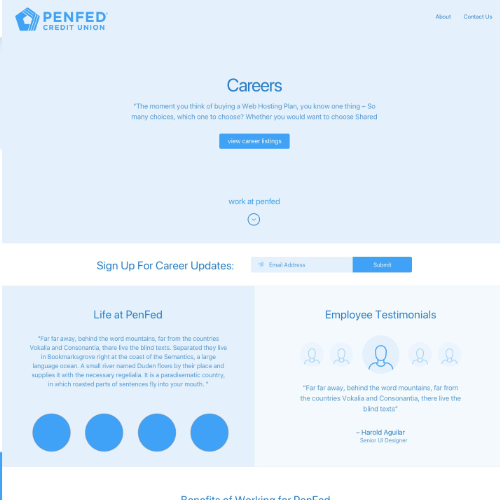
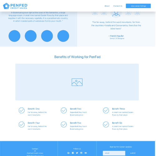
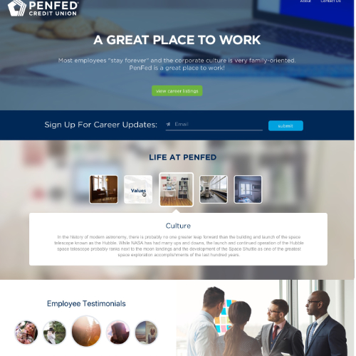
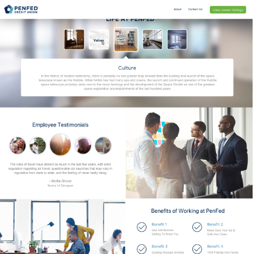
After the high-fidelity wireframes were tested with some sample users and met with positive feedback, we moved to full mockups. The mockups were deployed by our development team in the timeframe outlined on the design rails.
Auto Center
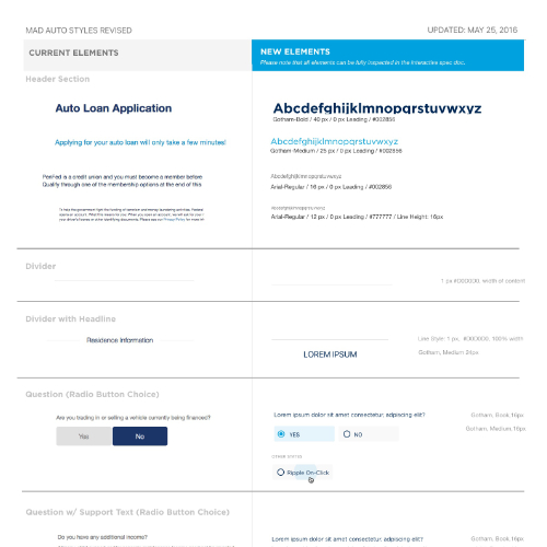
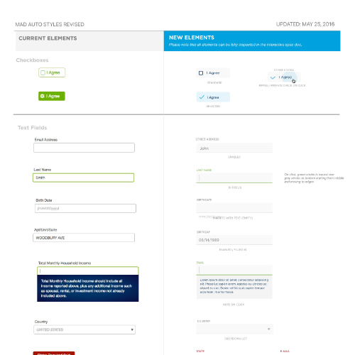
One of the larger facelifts we completed was to the auto insurance center. We not only restructured how the user would go through the auto loan application but also brought the auto center up to the newest brand design standards. Below I’ve included pieces of the documentation we gave to the developers outlining what to change on the site to fit the new brand guide.
Interactive Design Mocks
Giving developers access to a tool that allows them to click through the elements of your page to see spacing, fonts, exact colors, etc. is crucial to a successful design hand-off. Before InVision had "inspect mode", I used to hand off interactive mocks like the ones linked below to help avoid spacing sizing and alignment errors. If you click on each element of the page, you will see you can get all the spacing, font, and color data for each element. This is very helpful if designers want their developers to code accurately to the mocks. The interactive mocks aren't mobile-optimized, so desktop is a good idea here.

Credit Card Flows
Part 1
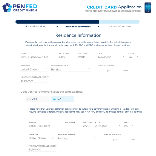
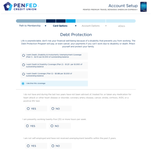
We found the progress bars that worked best for our purposes in the design system tab. Now we are applying that nav bar to all of our loan and credit card application flows. We created 2 iterations of wireframes for the flow below.
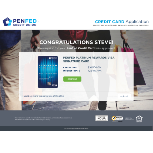
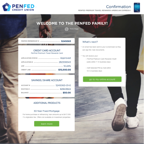
As you can see, the application process was split into 2 sections. The first section is before the decision page for a particular card. Once the potential client has been approved for the card, they’re able to continue with section two.
Part 2
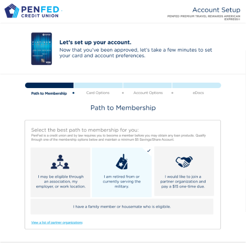
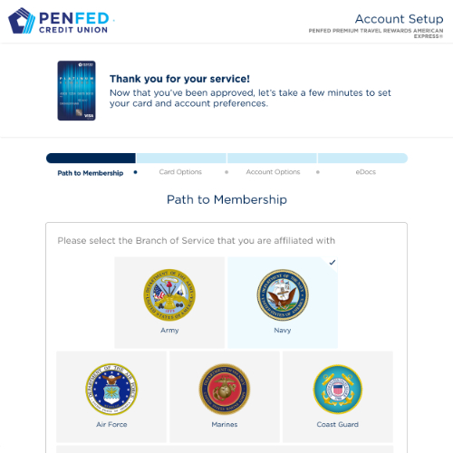
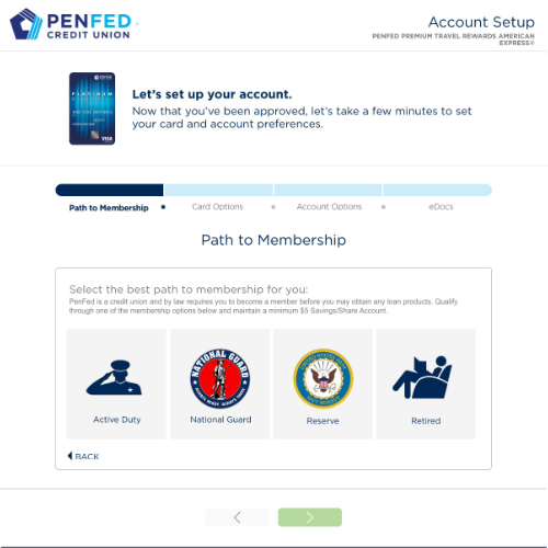
Since PenFed is a credit union catering to the military, the applicant must have served or be connected through family or a partner organization. Designs below show how we navigated through that extra layer of vetting before continuing with a more standard application process.
Login Modal Redesign
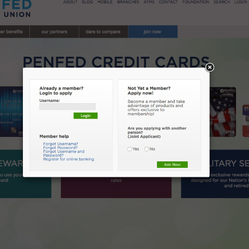
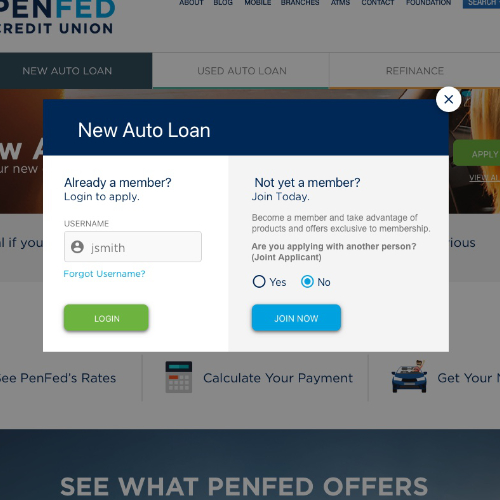
After developing a new brand guide, one of the first things I modified on the site was the sign-in / sign-up page. Below you can see the sign-in modal before and after the facelift. I introduced a clear hierarchy, cleaner aesthetic, and clear callout to the reason they’re signing in/up (auto loan application).


