
A one-stop mobile app that allows Zumba® instructors to easily promote themselves on social media with custom-branded assets.
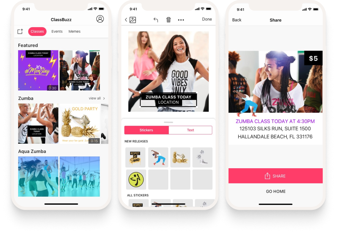
A one-stop mobile app that allows Zumba® instructors to easily promote themselves on social media with custom-branded assets.
To kick things off we had a discovery meeting, during which we explored the challenge, discussed the data we'd need, and came up with an initial hypothesis for the feature set.
Analyze ZIN (Zumba Instructor Network) surveys & business insight reports for trends and requested features.
Perform a competitive benchmark of social media creation and publishing products.
Host a 2-day design sprint to jump-start the project, align on goals, and shape a feature set grounded in user needs.
We conducted user surveys and in-depth interviews with instructors, then synthesized the findings to uncover patterns, pain points, and opportunities that directly informed our product decisions.
In the 2017 & 2018 Zumba Instructor Network (ZIN™) surveys, 4,000+ instructors told us:
A Zumba®-branded social media app was their highest-ranked feature the company hadn't built yet.
Most instructors already do their advertising on Instagram and Facebook.
Asked which features would be valuable, instructors said:
It would be helpful if we could access it on an app and if adding in our own pictures was easier. It takes too much time to use the Zumba marketing materials.
Every time I post something, it should notify all of my friends.
Provide more effects to add to my posts.
Zumba logos, quotes and signs on photos.
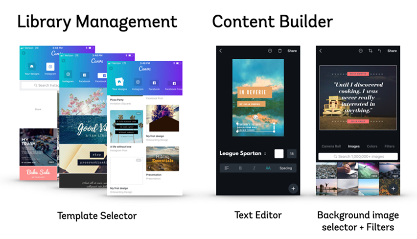
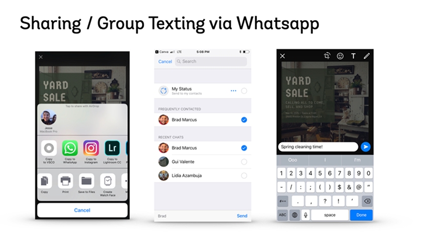
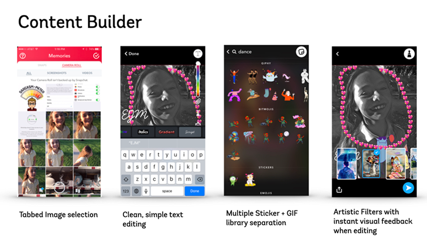
To ground our solution in industry best practices, we performed a competitive benchmark of social media creation and publishing products to identify common patterns that informed our direction.
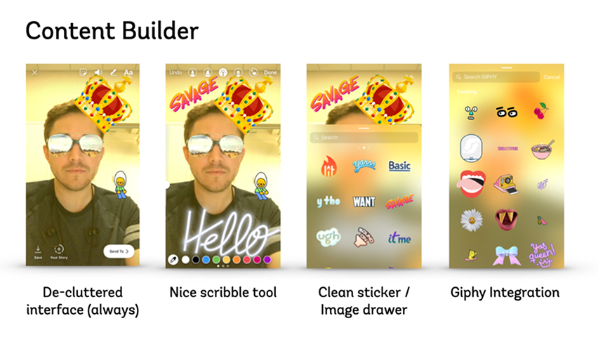
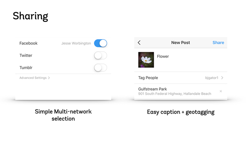
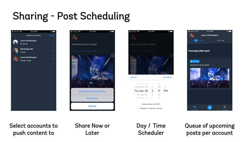
With research in hand, we synthesized instructor behaviors into three personas that shaped every design and prioritization decision throughout the project.

"I know that social media is where the people are. How do I get to them effectively?"

"I've taken a lot of steps to promote myself with some success. I know I could be doing better though."

"My gym handles everything for me. Why do I need another app? Also, why is everyone so excited about Instagram?"
We hosted a shortened version of a Google-style Design Sprint to quickly jump-start the project, align on goals, and rapidly shape an initial feature set grounded in user needs.
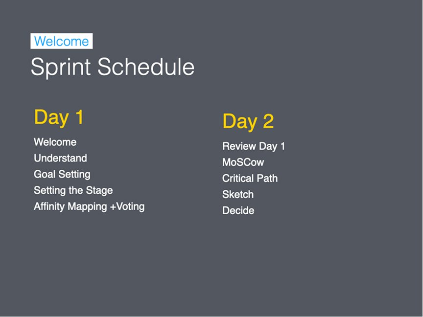
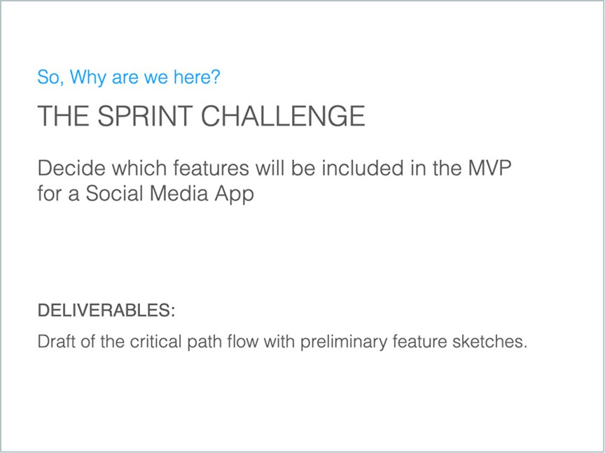
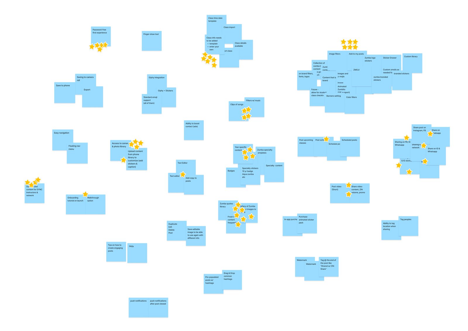
The first day focused on understanding the problem space, goal setting, defining success metrics, and affinity mapping.
Easy way to create and share custom branded marketing materials on social media to promote your classes and yourself.
(Short term goals plus) An easy way for instructors to get insights, communicate with students and manage their classes / students.
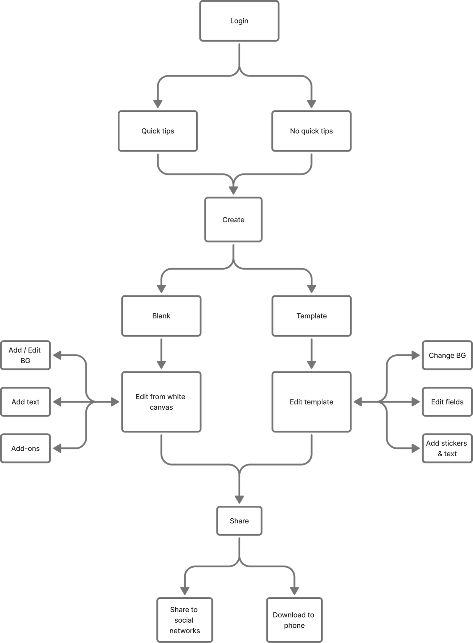
On Day 2, we ran several narrowing exercises: MoSCoW prioritization, critical path user flow, and Crazy 8s sketching.
The first of our final deliverables from the design sprint is a simplified end-to-end user flow. The next section down has "Crazy 8" illustration mapped to that step.
Each participant took 8 minutes to sketch 8 screens based on one step in the user flow. These voted winners formed the foundation for our initial prototype.
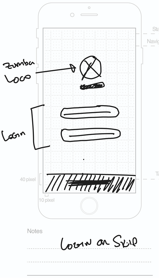
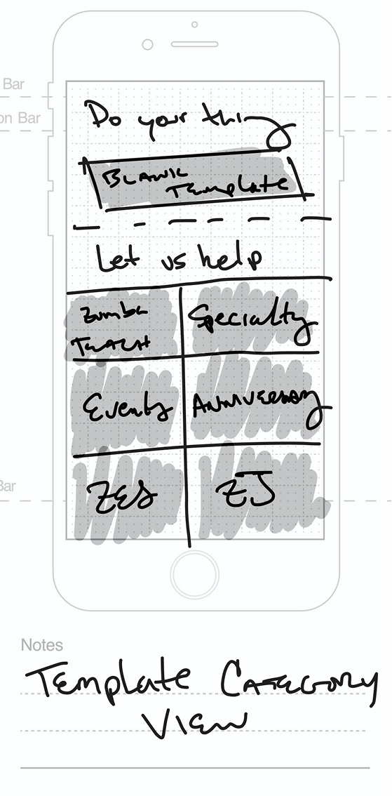
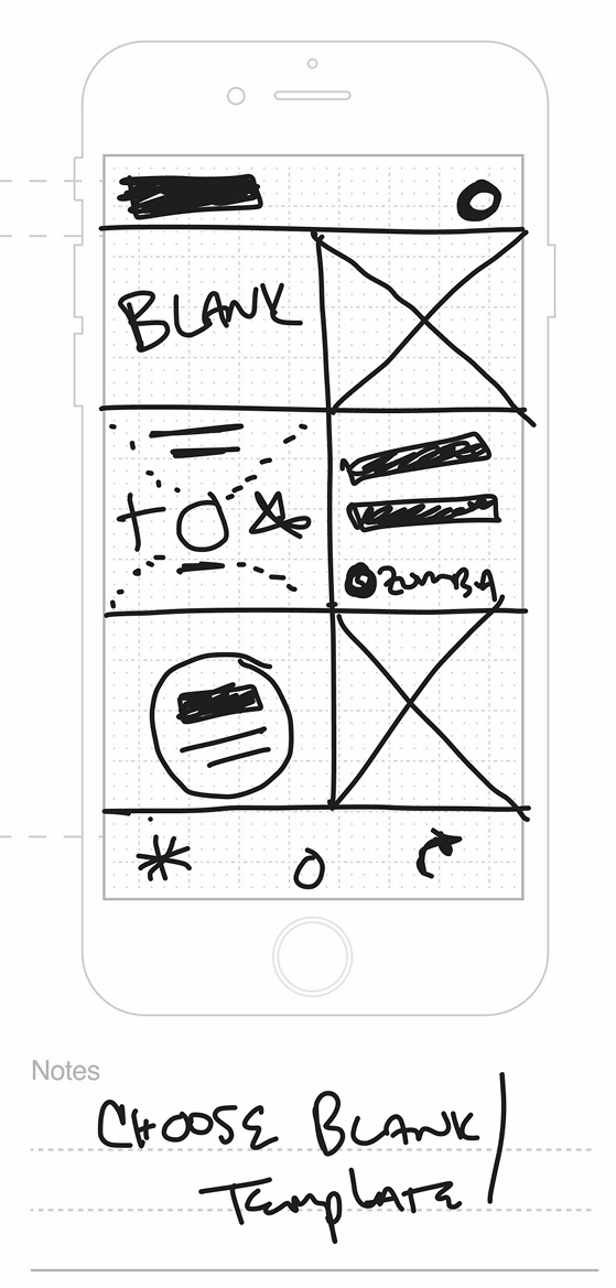
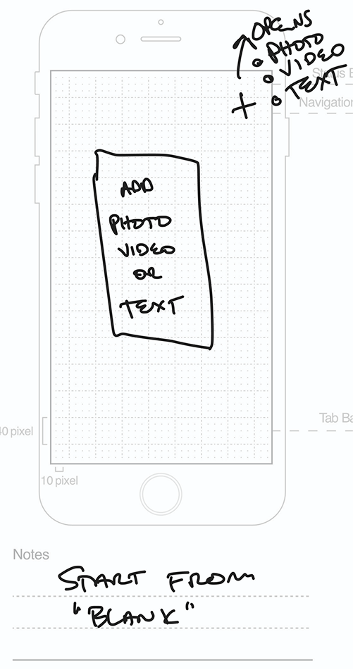
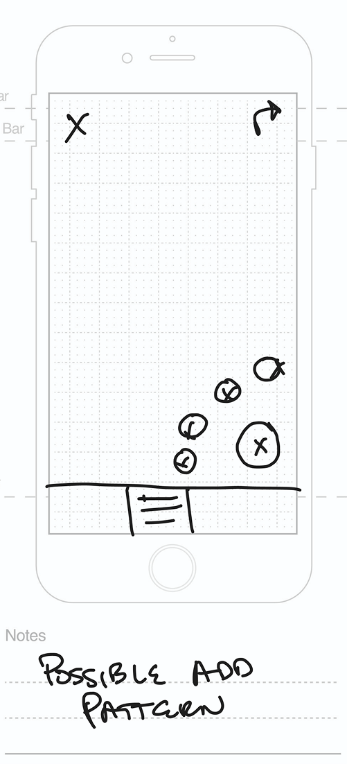
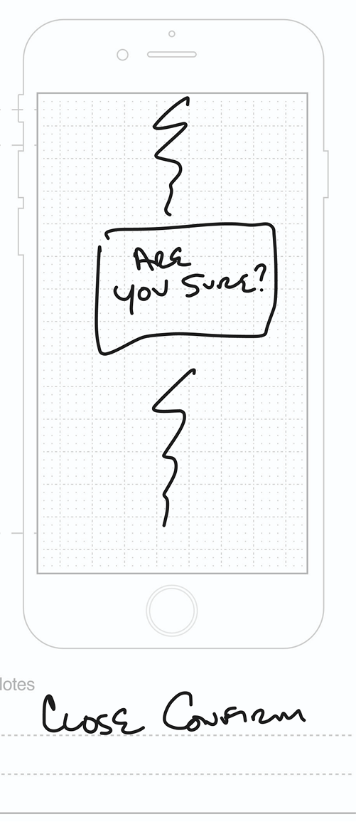
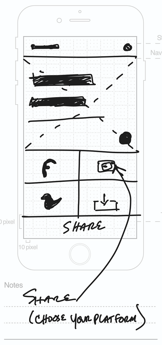
After aligning on key insights from the ClassBuzz design sprint, we began translating our validated ideas into workable solutions. We refined the top concepts from each sprint exercise — evolving them into a happy path flow and rough wireframes that laid the foundation for our next round of design exploration.
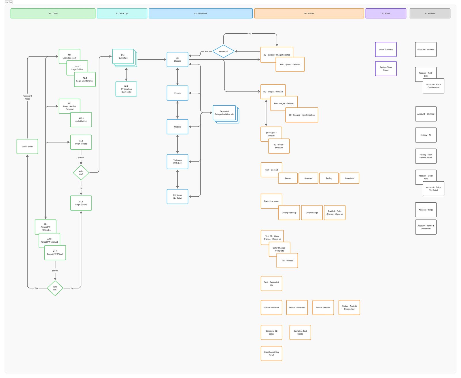
Using the sprint-generated flow as a foundation, I refined and extended it to capture the full range of ClassBuzz use cases, clarifying how each feature would support instructors from creation to publishing.
Three sets of wireframes were developed and tested with Zumba® instructors. Each round of feedback directly shaped the next iteration.
V1 had a very simplistic UI — three buttons below the canvas for text, stickers, and sharing. Background changes were triggered by tapping the canvas itself.
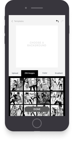
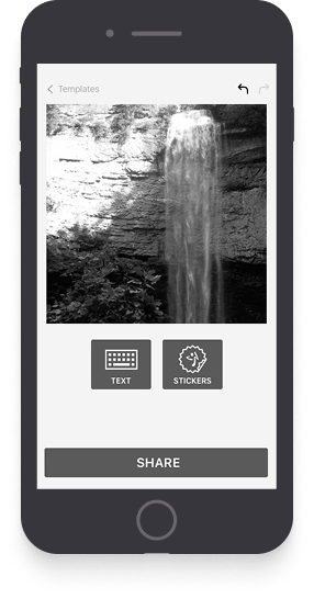
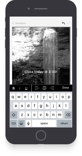
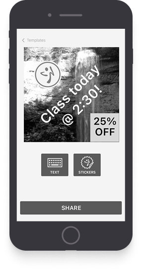
How do I change the background? — Wait, I have to tap it? Yeah, I never would've guessed that!
We auto-opened the background selector and placed background, text, and stickers as tabs on the right rail — each tab acting as its own workspace.
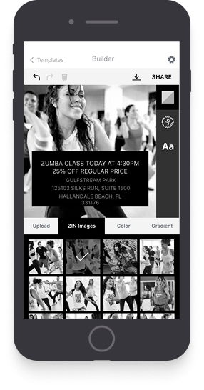
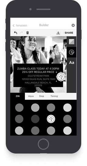
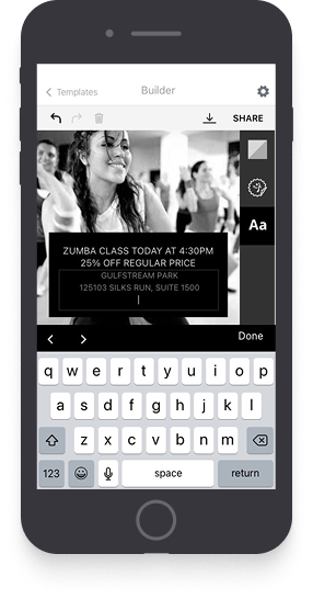
Are these colors or stickers? How do I customize the post with different color text?
Version 3 brought enhanced text controls — adding color options for text and text backgrounds, plus simpler sticker controls for a better overall preview experience.
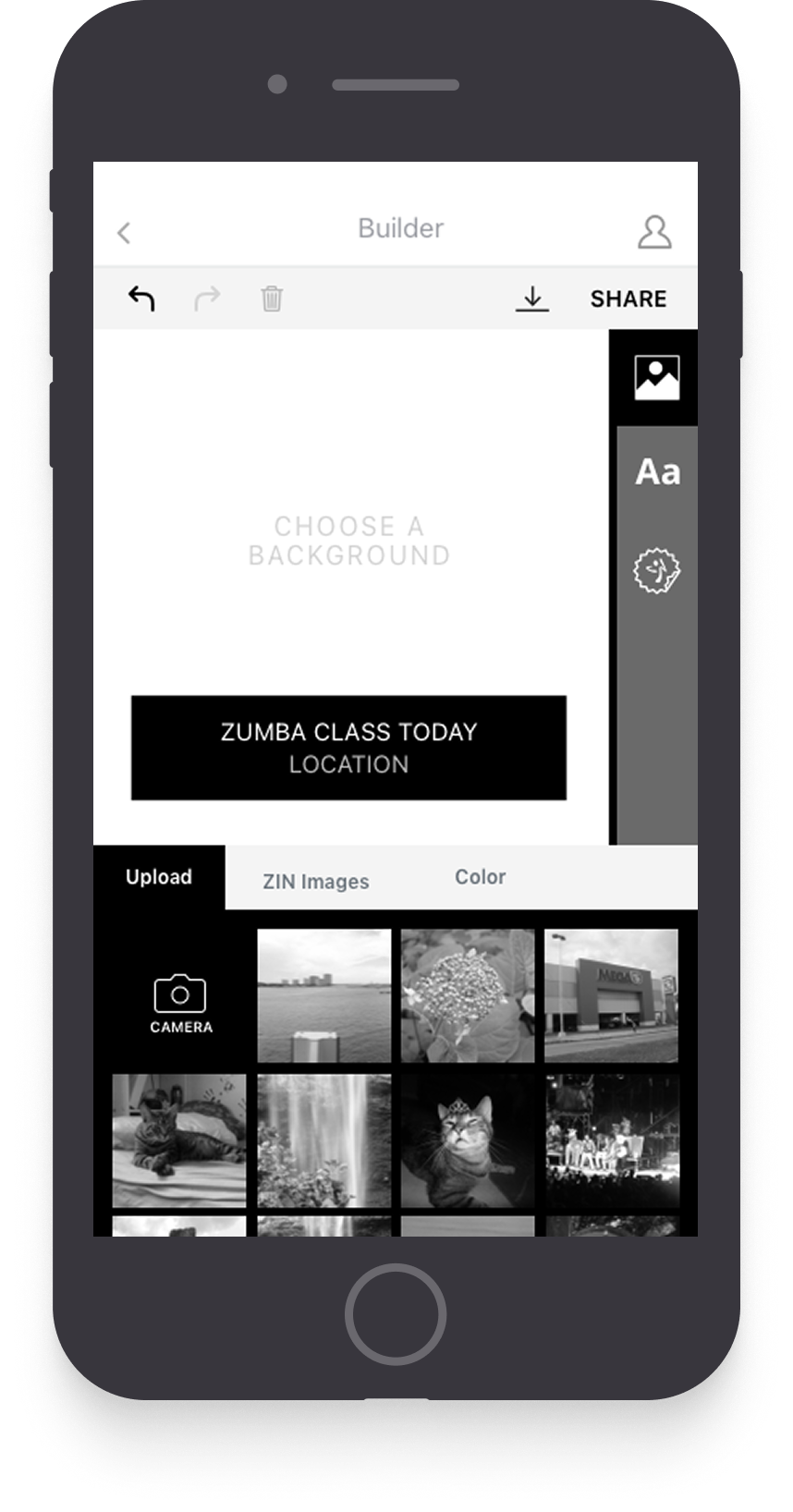
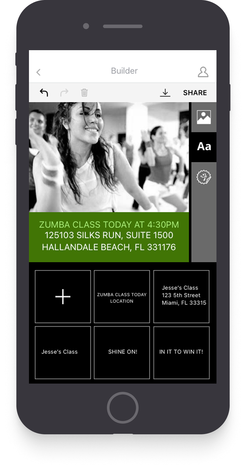
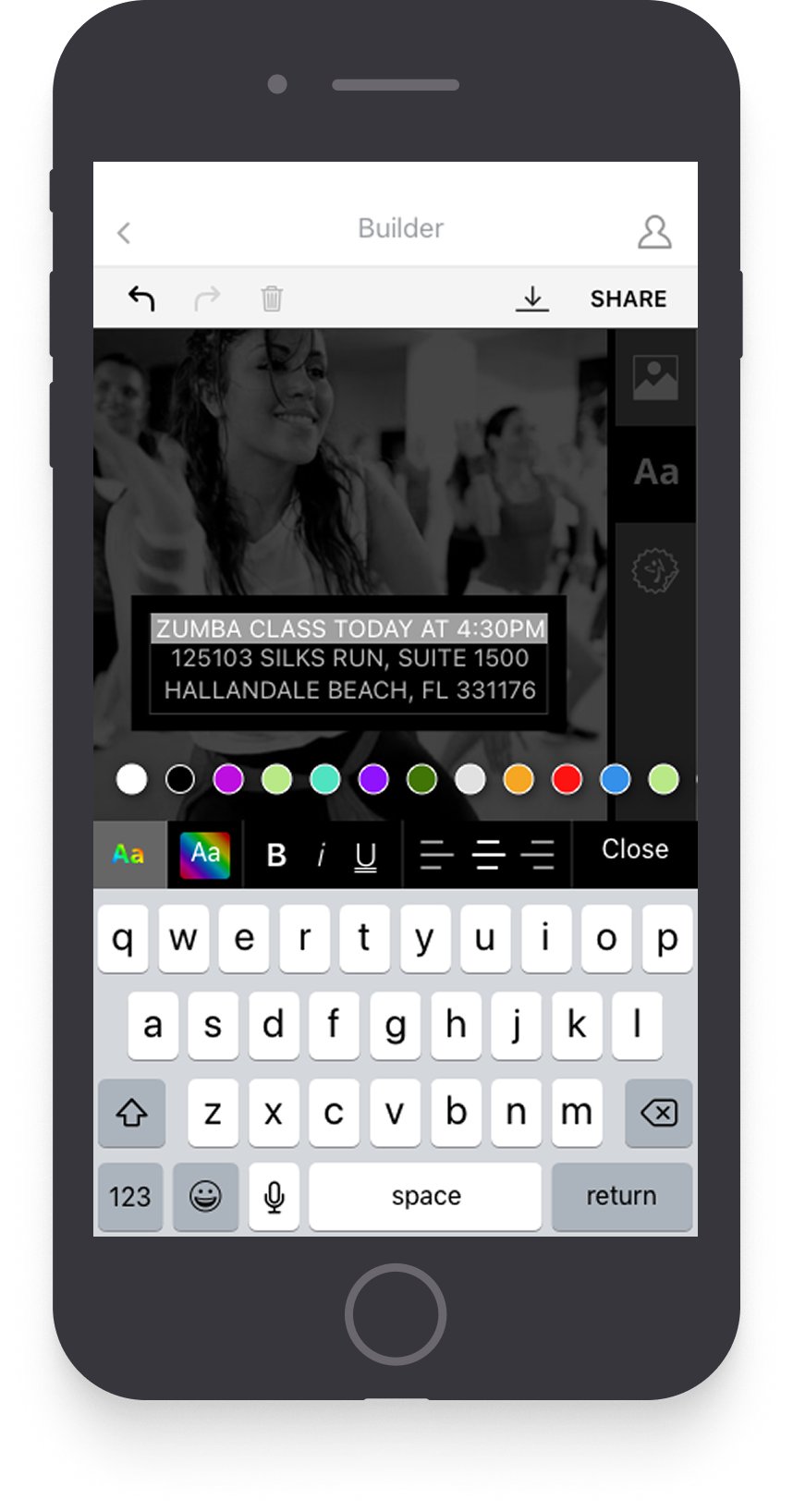
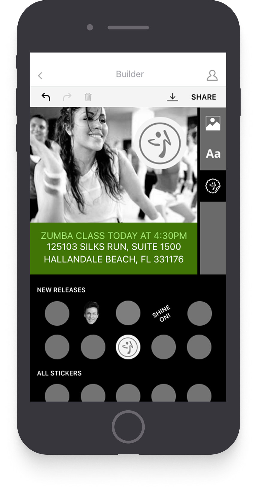
My eye doesn't go directly to the spaces on the right bar. Placing that toggle with my text and stickers makes more sense to me.
Taking final user direction from wireframe testing, we moved controls below the canvas and undo/redo/delete to a narrow right bar — placing them in a more natural spot.
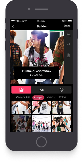
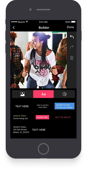
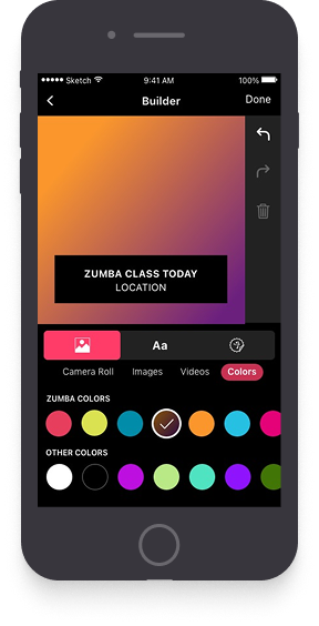
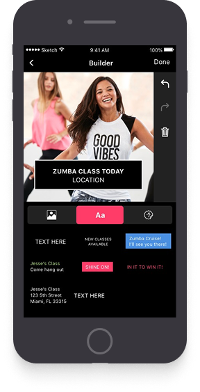
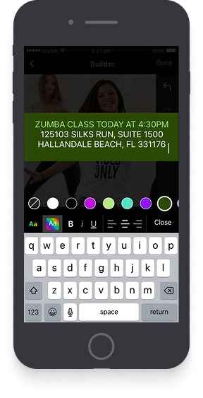
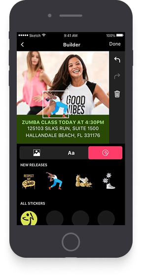
This is looking really good, guys, but why is it so dark? My classes are light and fun — so is Instagram and Facebook!
After testing v1, users were still unsure where to begin after selecting a post template. This led to the second and final version of our designs — now available on the Apple App Store & Google Play Store.
Here's what changed:
Dark to light: Moved from a dark palette to a light, energetic one that better matches Zumba's brand personality.
Larger workspace: Removed the right bar to better use horizontal screen real estate.
Quicker workflow: Top nav creates a stepped 1-2-3 flow. Separating background selection from post creation simplified the process and proved out in testing.
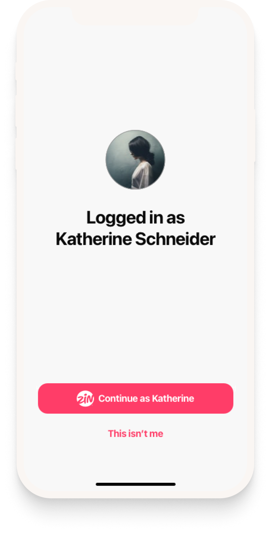
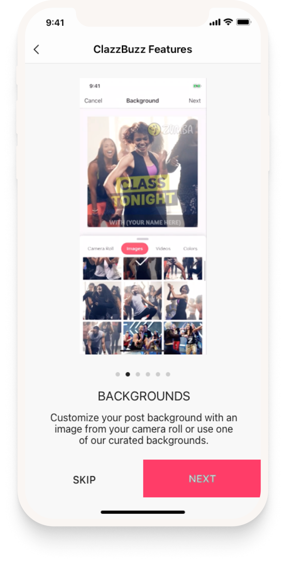
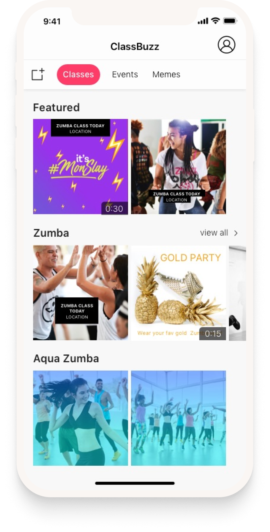
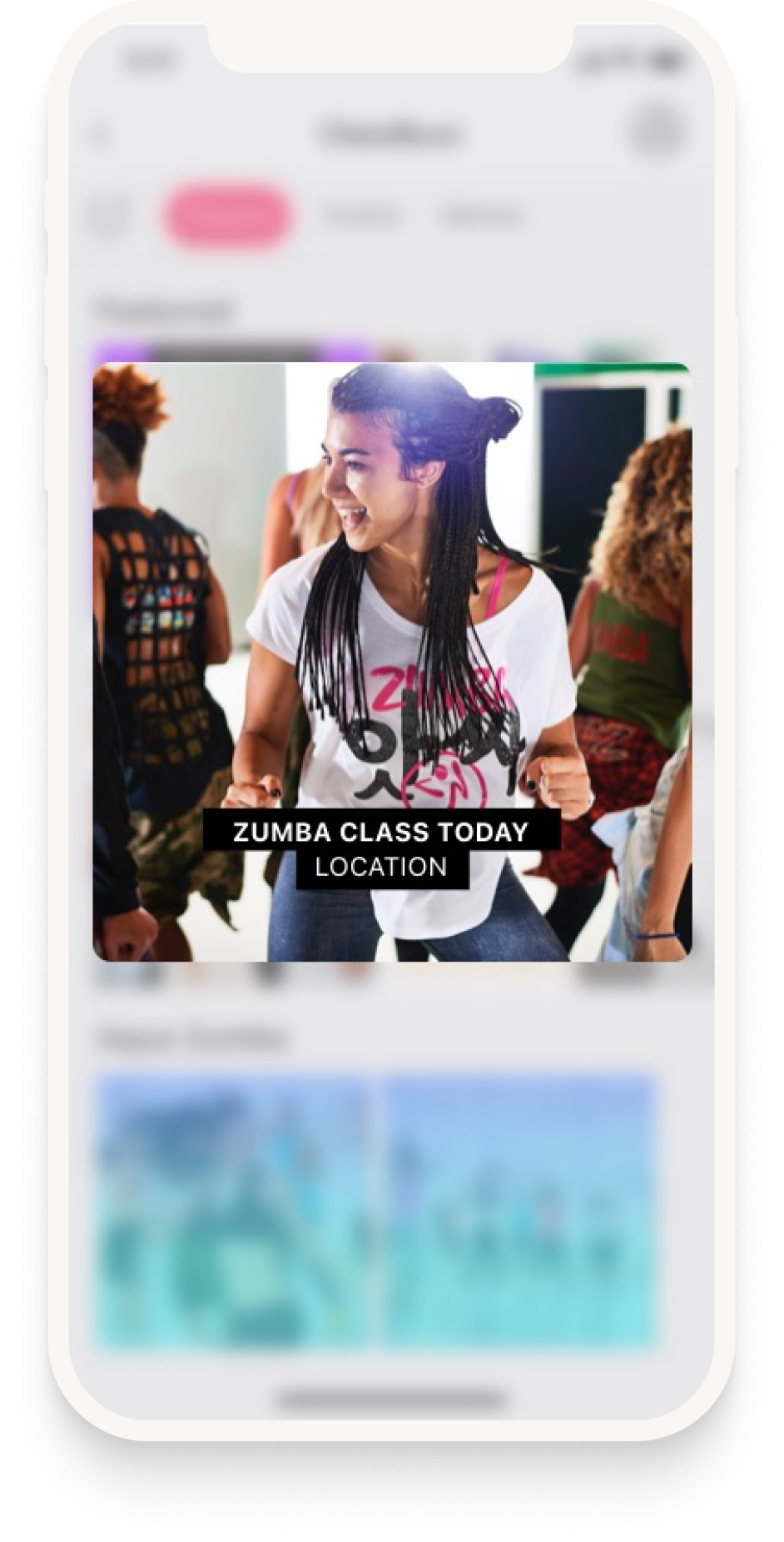
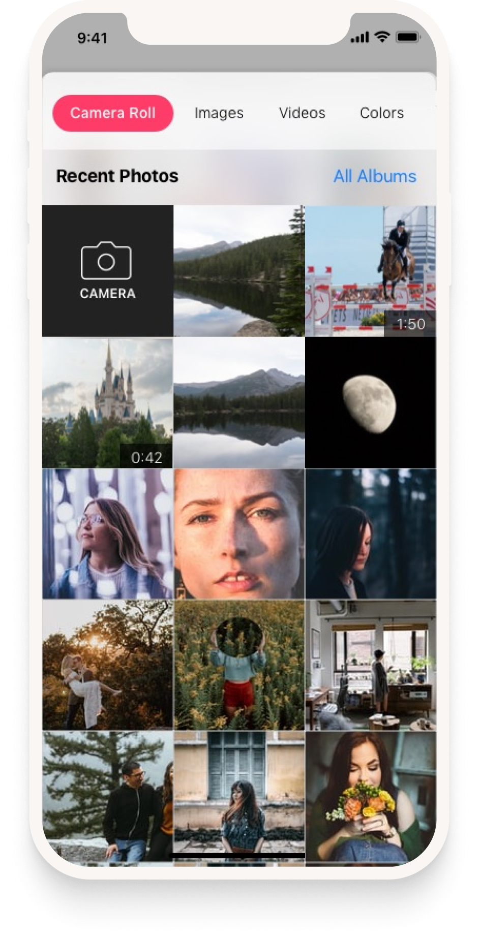
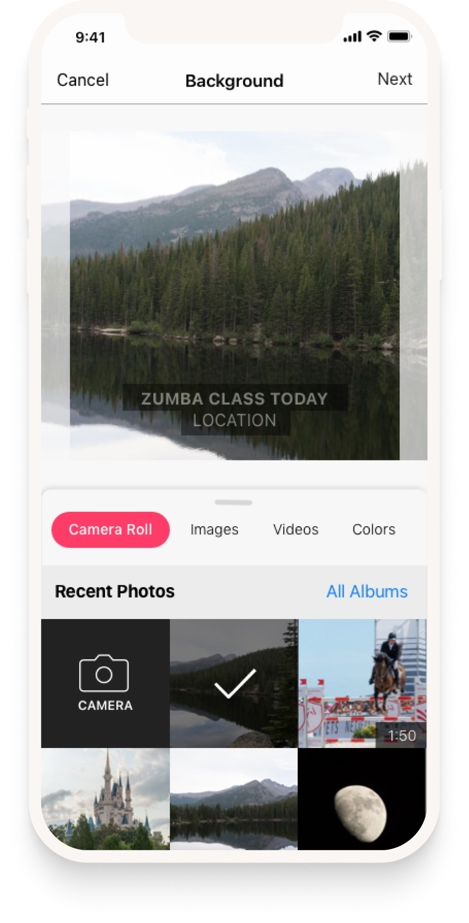
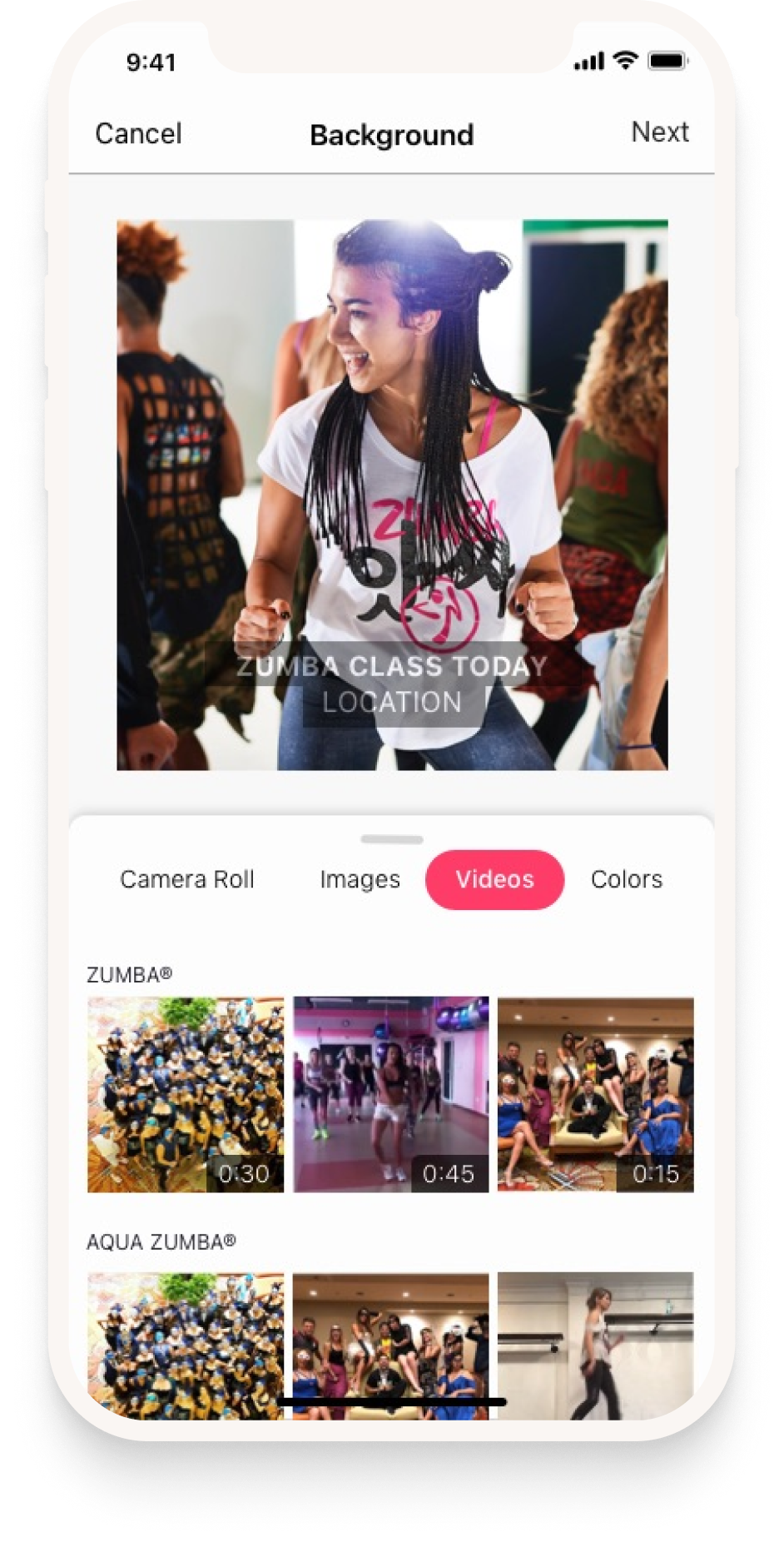
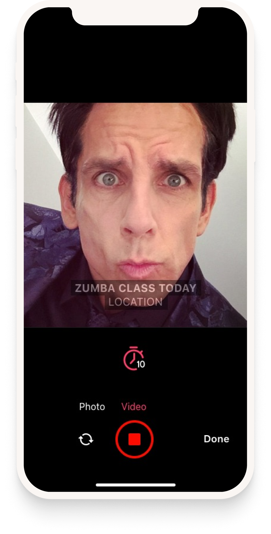
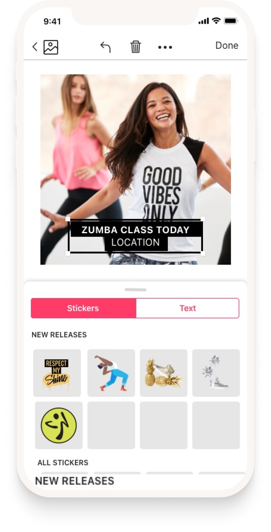
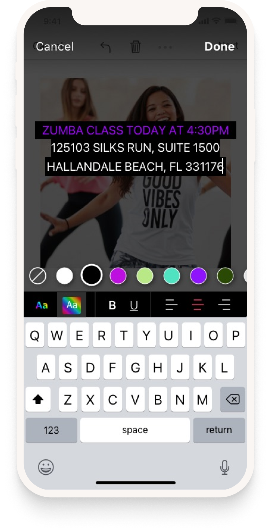
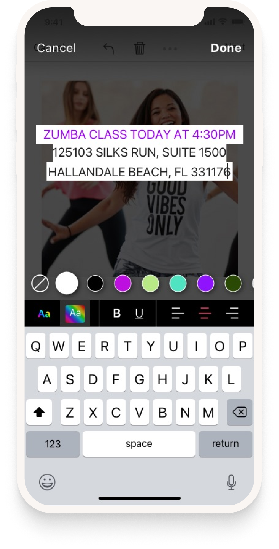
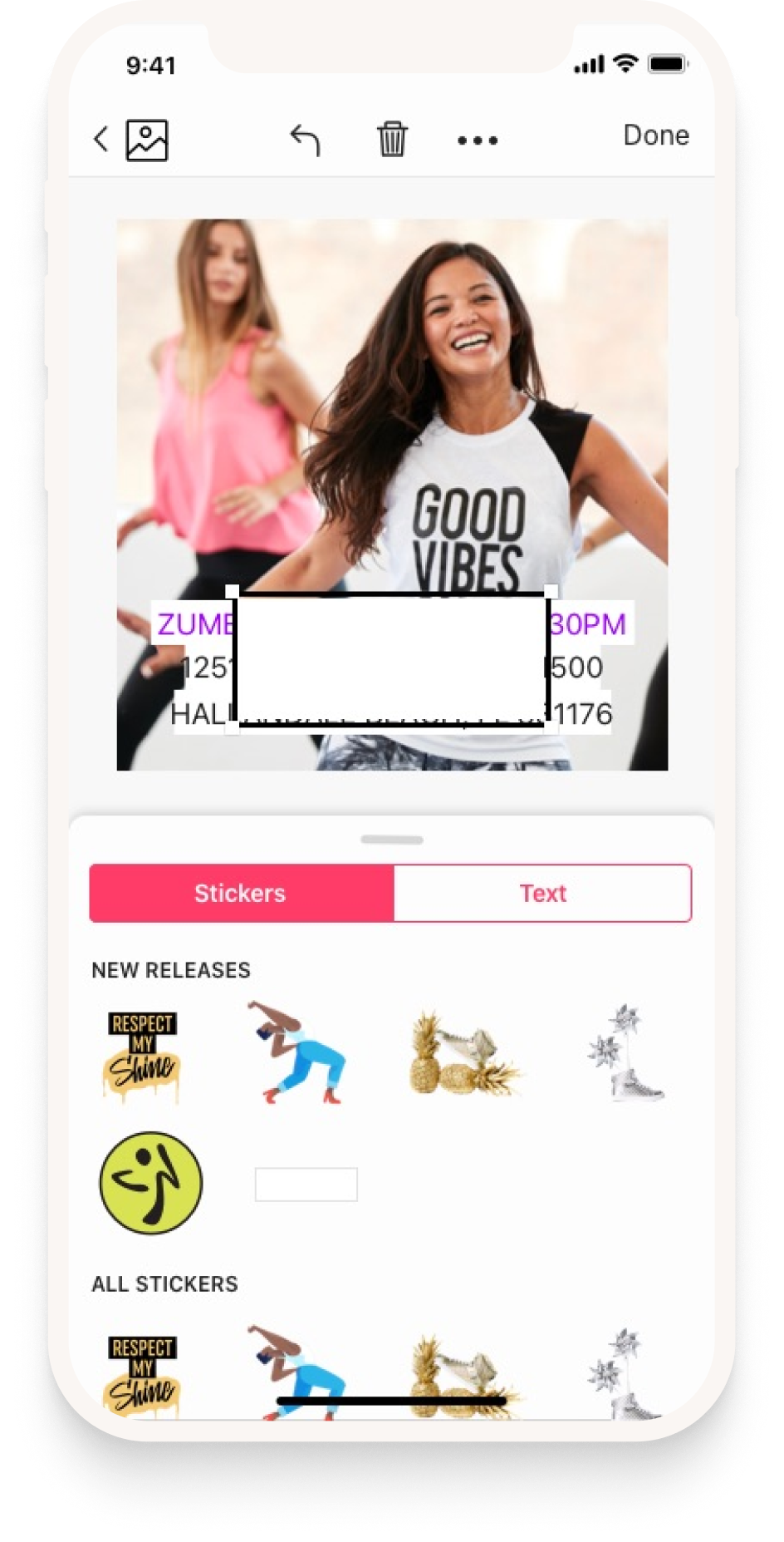
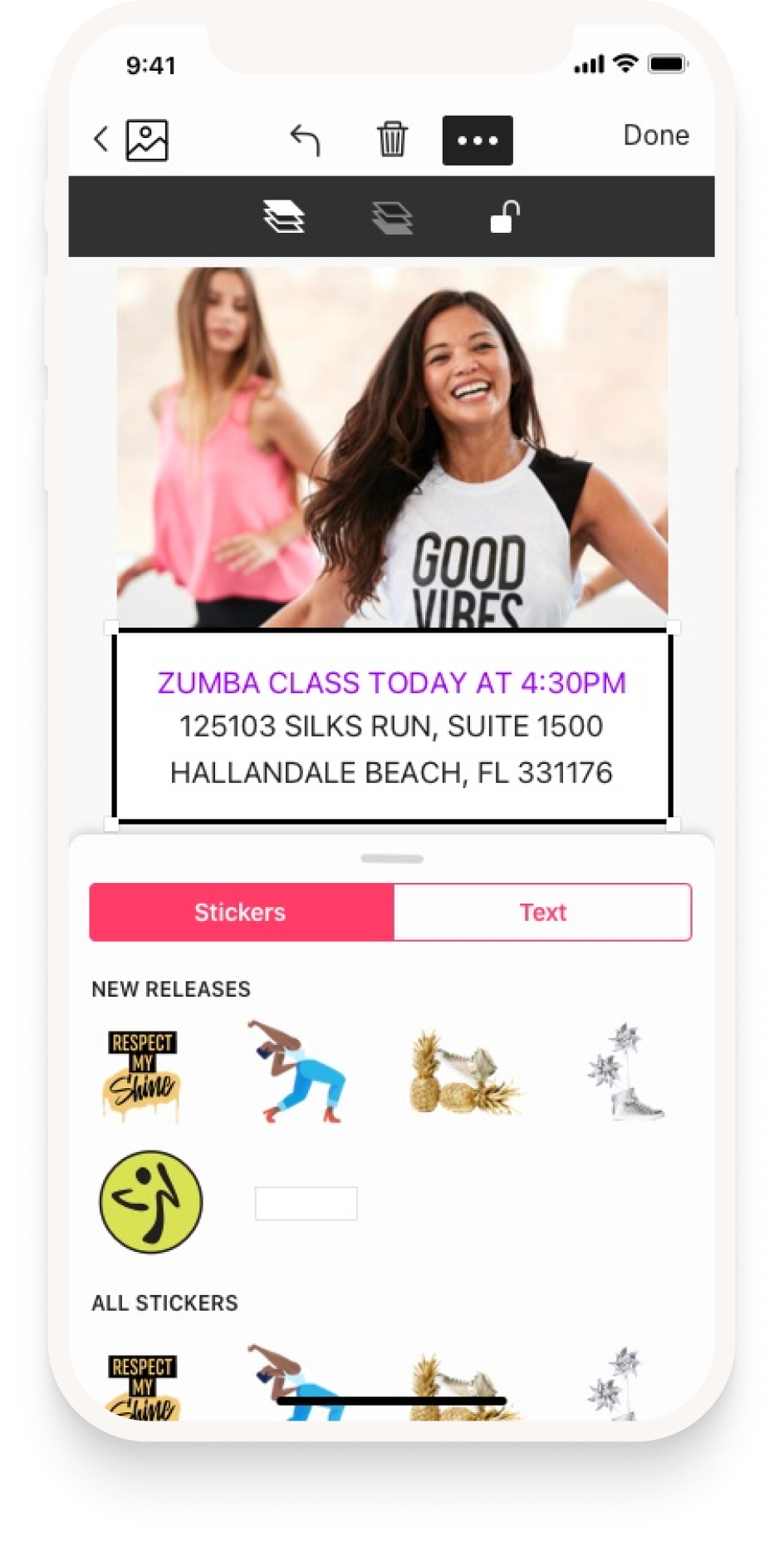
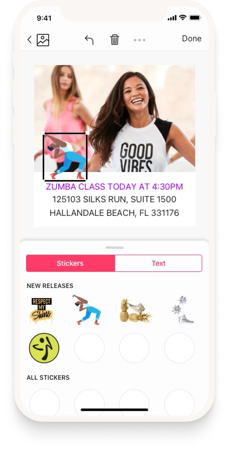
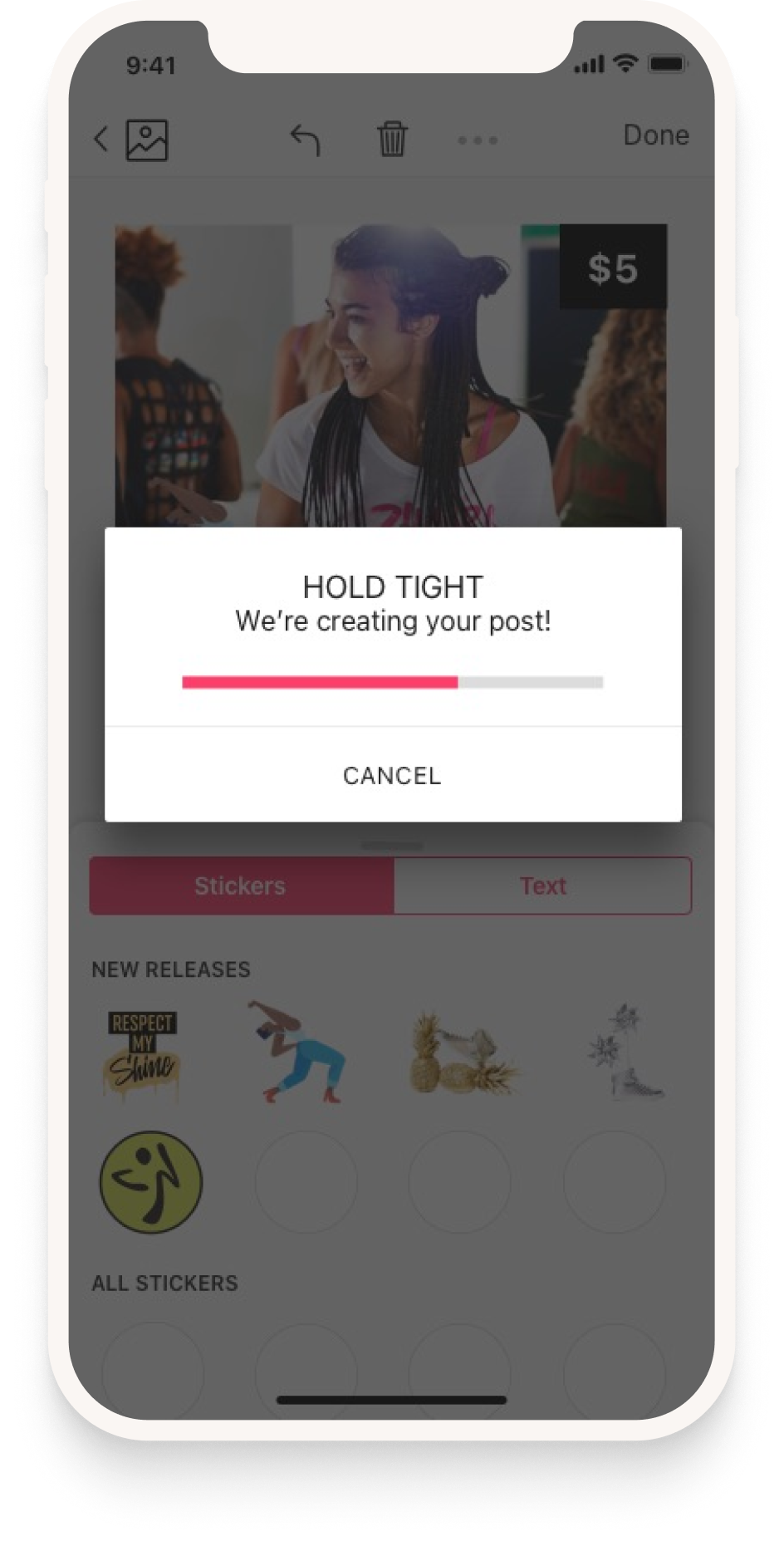
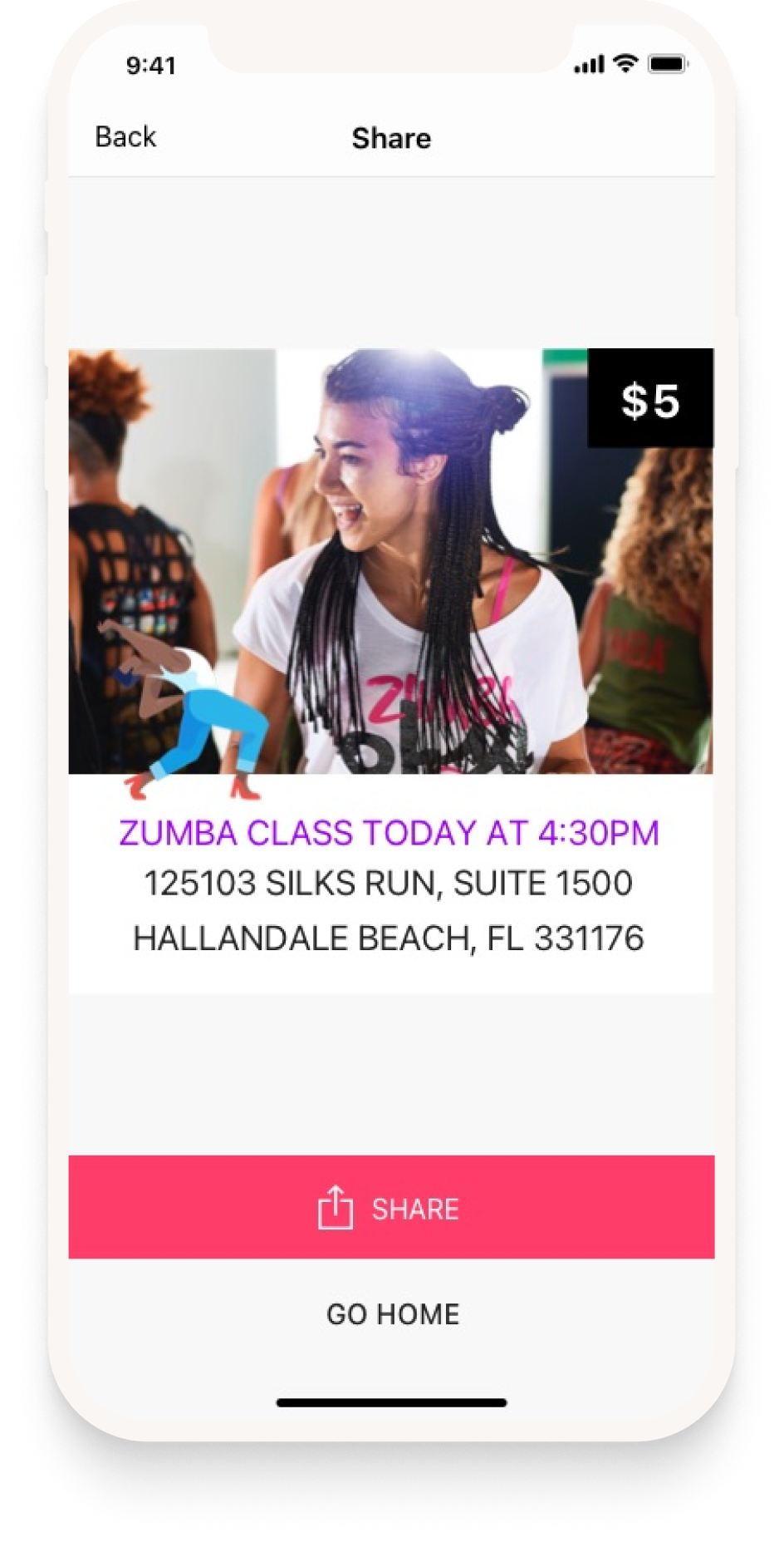
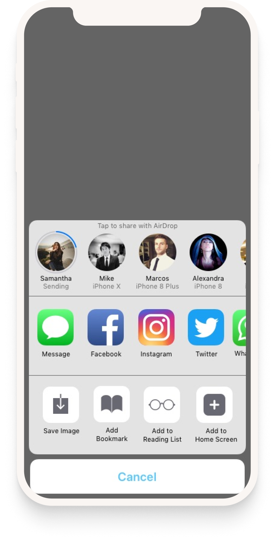
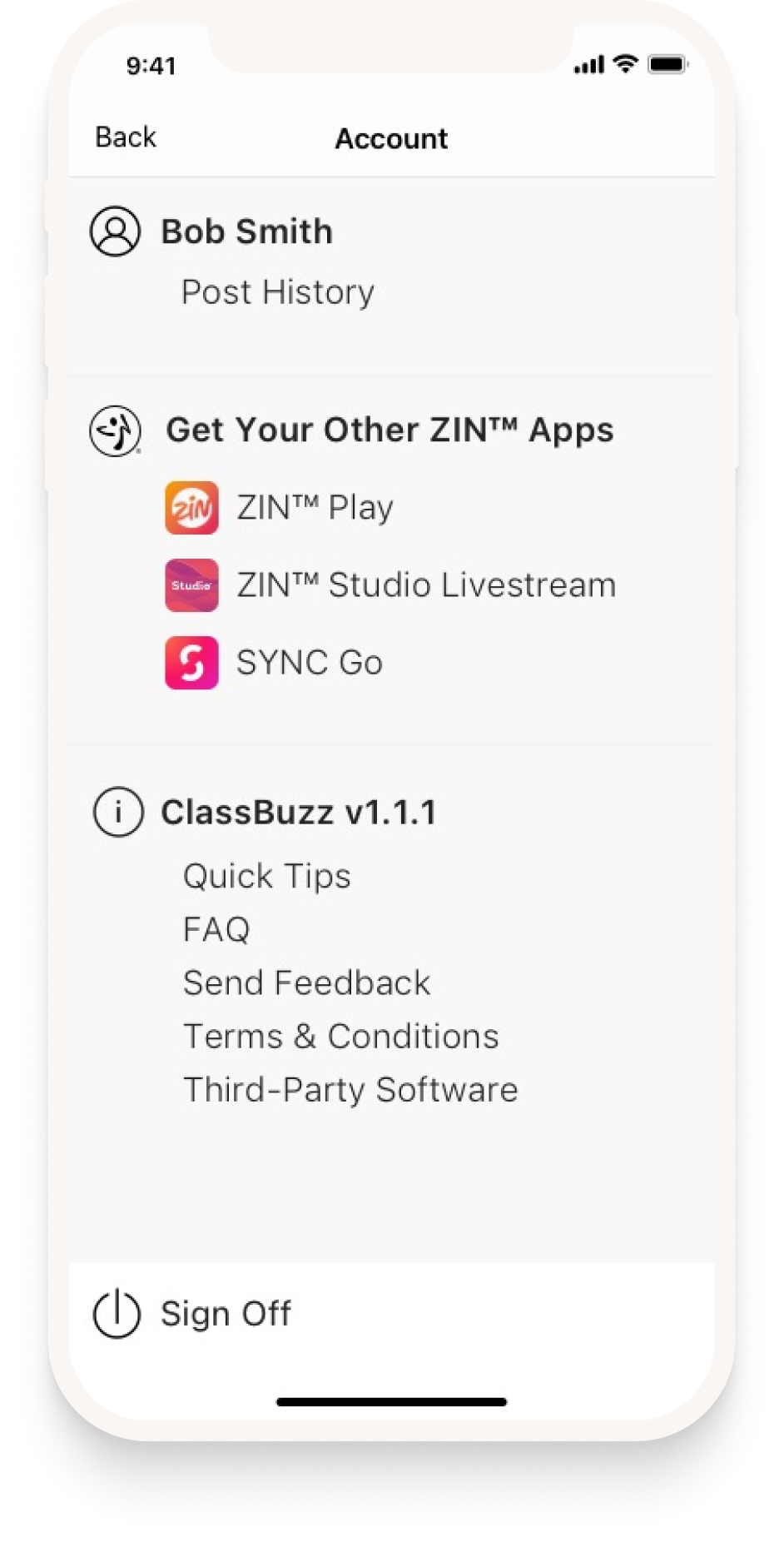
Once we received the final brand direction from our marketing team, I used their patterns, colors and fonts to put together the following app store promo screens for Apple & Google Play stores.
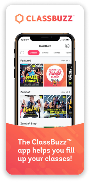
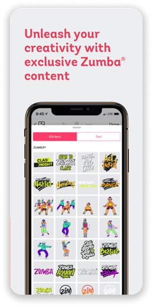
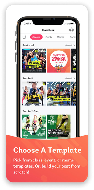
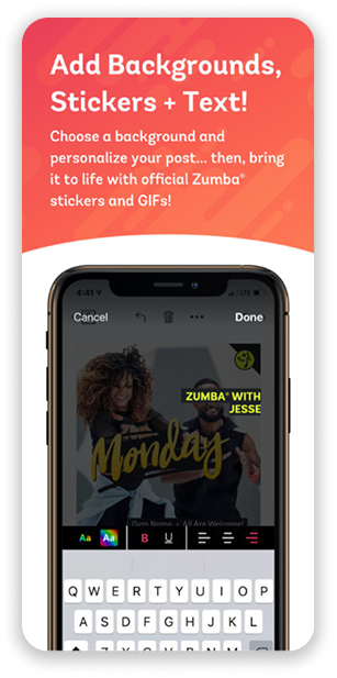
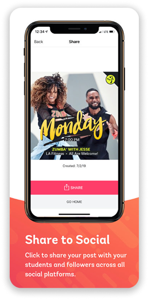
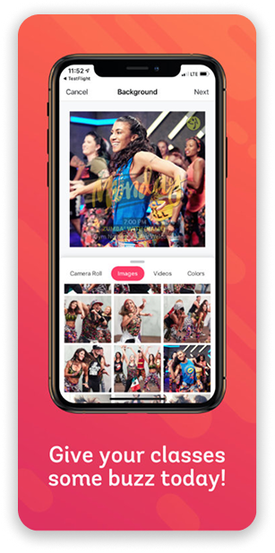
ClassBuzz is currently on the App Store and Google Play Store. Since its launch, tens of thousands of Zumba instructors have used it to elevate their social media presence with professionally designed templates.
Balancing freedom vs. control: It's challenging but important to let instructors express themselves while enforcing brand consistency — well-designed constraints actually help both parties.
Mobile-first is essential: Many instructors rely entirely on their phones for business. Building mobile-first made adoption far more likely than a desktop-first approach would have.
Scalability demands smart UI: Offering templates and a curated asset library reduces support burden and ensures every instructor can produce good-looking content — regardless of design skill.